As part of the Tokopedia New Search Experience, we redesigned the product cards for the first time in 4 years. We launched this project because the product cards were cluttered with unnecessary details. Our focus was to explore fresh design styles that highlight only the most important and engaging information for users, and to create guidelines for building and maintaining these components.
Collecting design ideas and solutions from various perspectives
Collecting the problems from product teams and users
Cracking and exploring the problems and solutions
Analyze the performance for give a better experiences
6 months of development lifecycle. 1 month focusing for designing
It was handled by only 2 designers who managed the entire end-to-end experience.
Product card is a global components. So when the product card changes, all of the product card at Tokopedia will impacted.
Can boost number of click on search and others modules
Elevate number of user buying increase
Help and reached to achieve the TIV target
The new product card also have a good impact in all metrics analyzing by impacted on page by incubated experiment method.

Introduce a seamless and engaging experience for Tokopedia product cards.
Develop a comprehensive design guideline for Tokopedia product cards.
Define and standardize product cards as global components across the Tokopedia platform.

Design and deliver a seamless end-to-end experience for Tokopedia’s new product cards.
Implement and maintain the product cards consistently across all Tokopedia pages.
Collaborate closely with product designers, product managers, and engineers.
Ensure all design deliverables comprehensively cover every product card use case.

Identify areas for enhancement to deliver a better product-card experience.
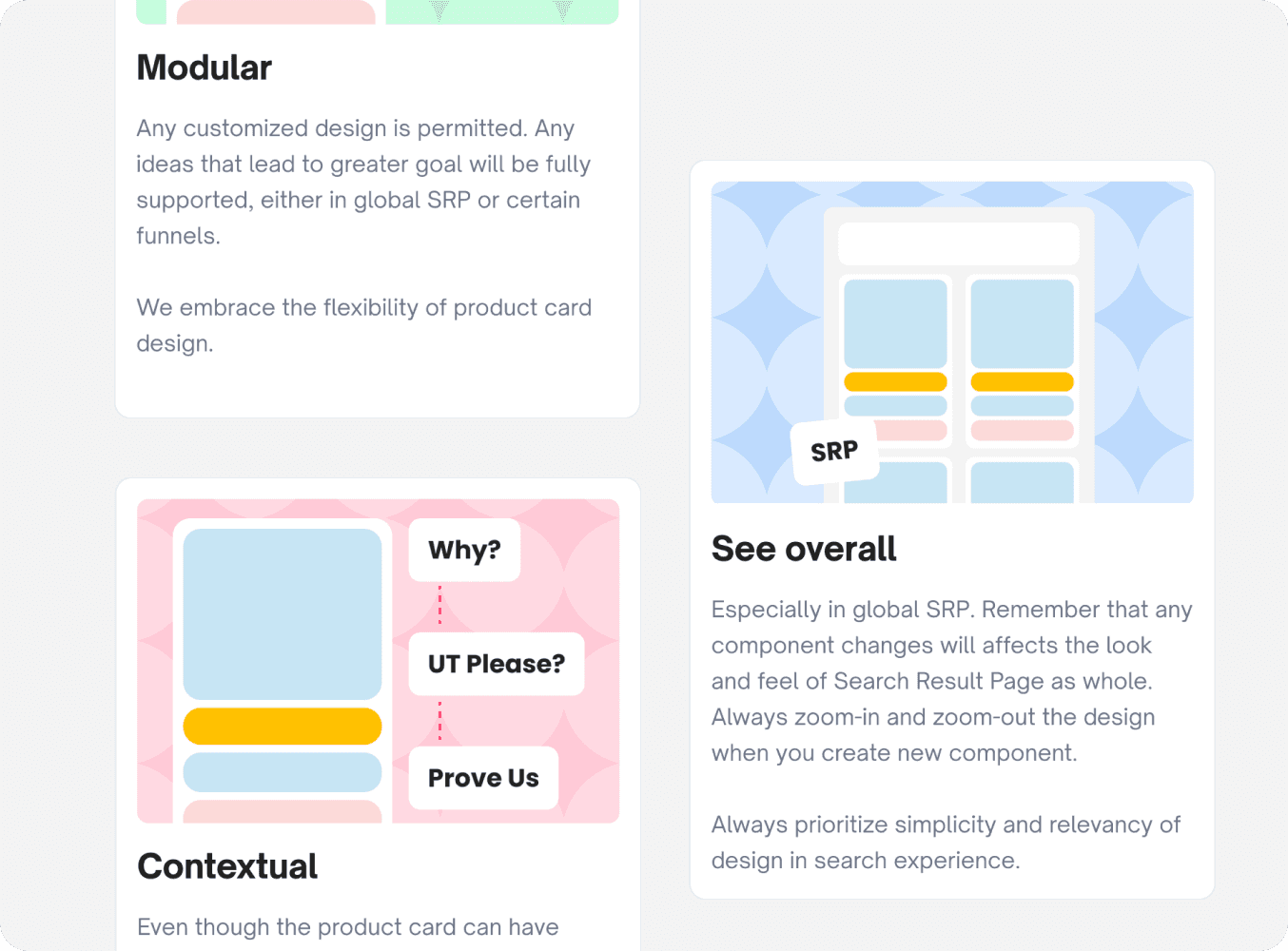
Define three new core design values for product cards.
Crafting explorations and detailed specifications.
Develop a new guideline, rules, and do and don’ts for product card.
Oversee and participate in the entire development process.
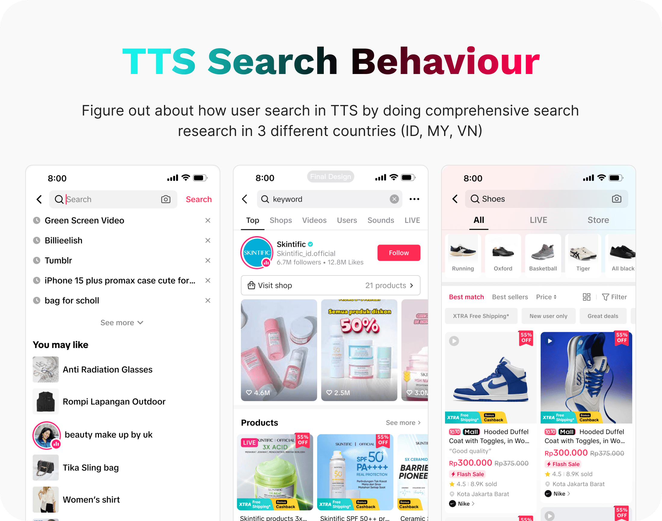
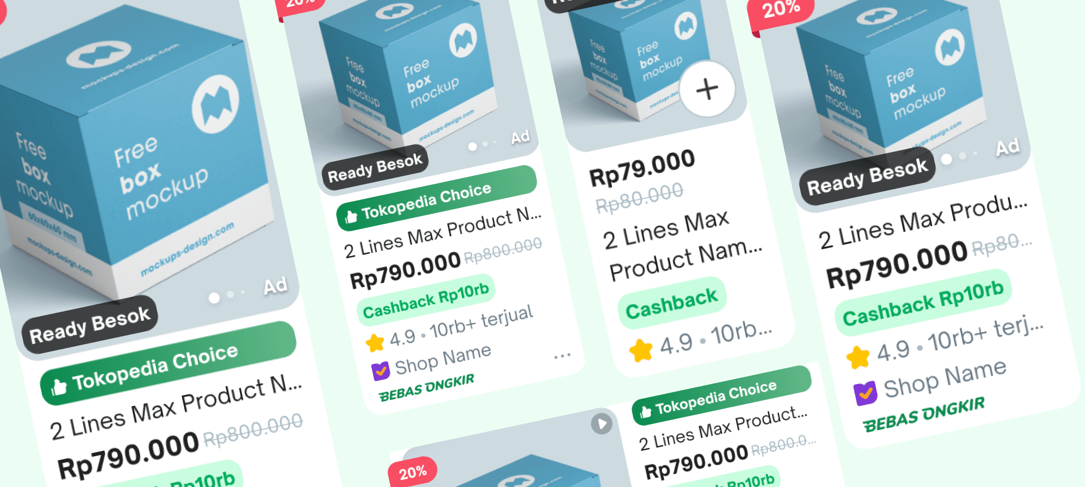
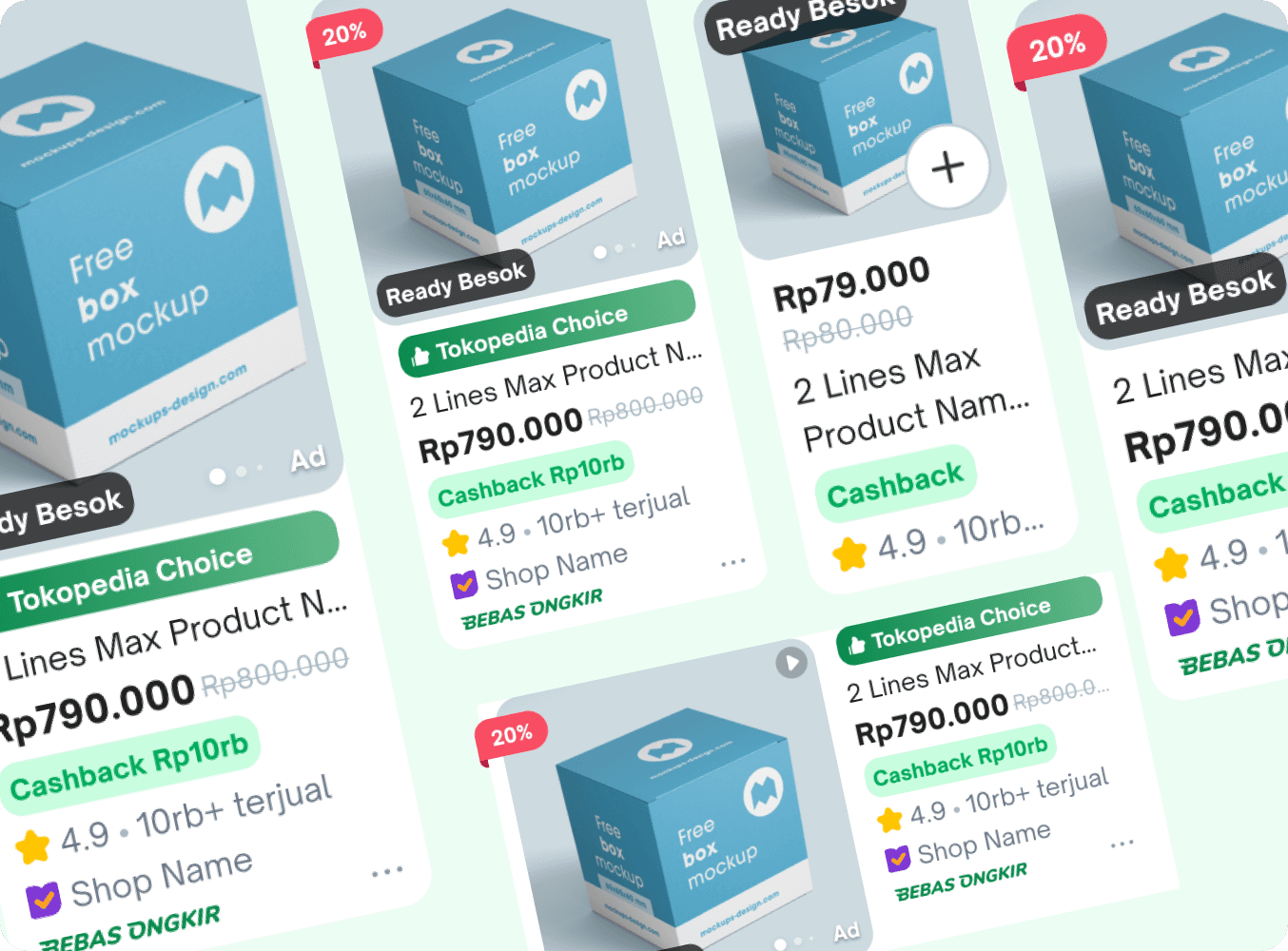
A crucial first step in this large project was validating and identifying issues with our product cards. To do this, we reviewed our existing designs and compared them with product cards on other platforms. This helped us refine our validation process, boost efficiency, and stay in line with the latest design trends.

We analyzed both qualitative and quantitative data to uncover user pain points. This approach gave us clear insights into user behavior and highlighted the information that matters most to them.
Keytakeaways
From our analysis, we found many details on the product card that are not very important to users. Examples include halal status, weight, the Add to Cart button, promotional labels, and more.
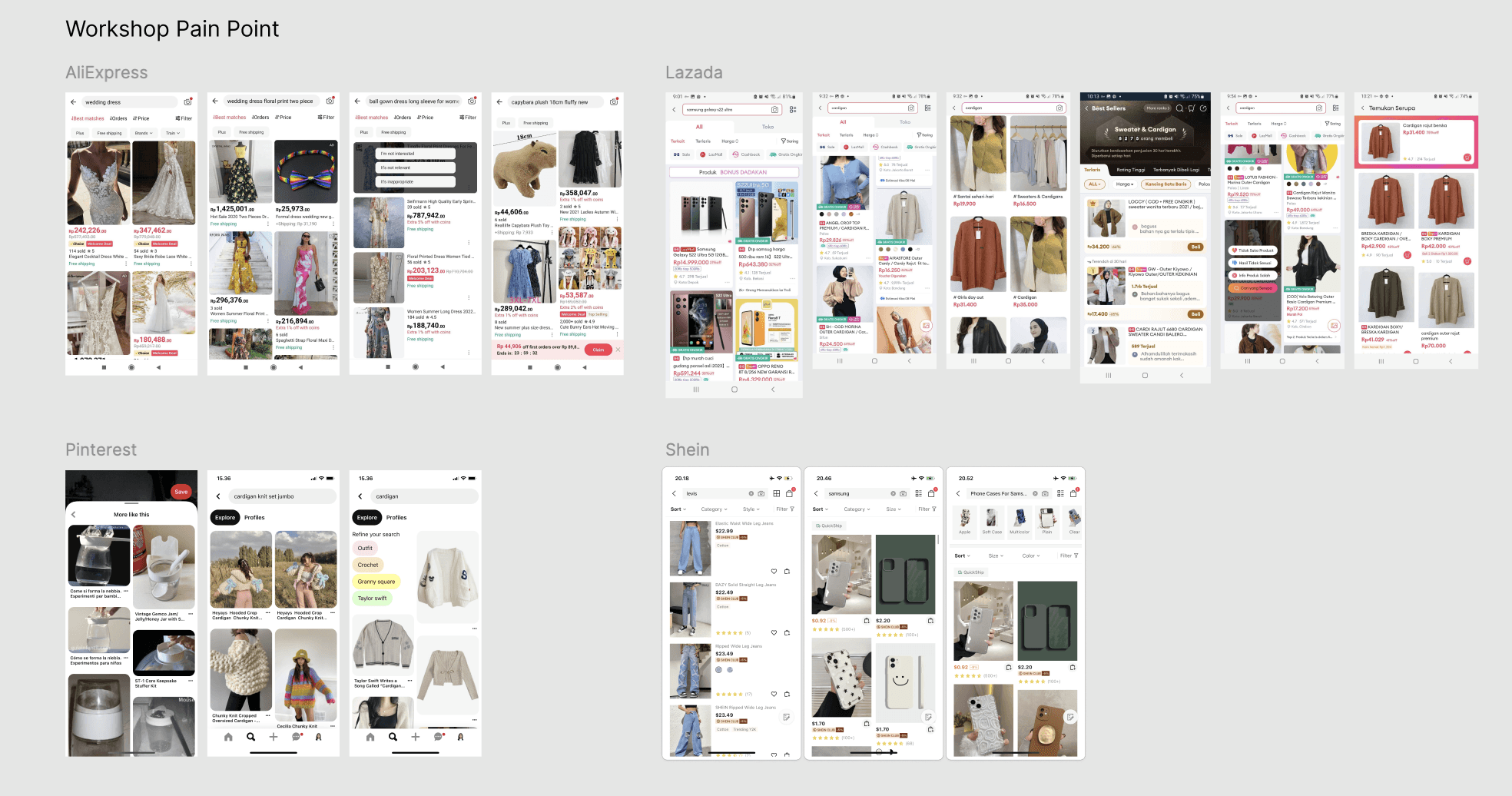
While product cards on different platforms share some similarities, each has its own unique style. Our benchmarking revealed that our cards still use an outdated design, so we need to modernize them to meet current trends and user expectations.
Keytakeaways
After benchmarking products across various platforms, we learned that strong products adapt content based on user search intent and present information in a clear, straightforward way.
Finally, we conducted an audit of our product cards, examining every detail to understand their structure and pinpoint areas for improvement.
Our Findings
After we do some thinking together and validations with a qualitative, quantitative, subjective judging, and users feedback. We can conclude that we will focusing in some area.
The previous product has a lot of informations. But some of informations is not important and not helpful for our users. Our users are not engaging with the information that will not help them in consideration to buy a products.
Our product card just only focus on how to show much informations to our users. Because of that our users feels that it not helpful because the’re feel confused about what they need to see.
This pain points are coming from the internal design teams because usage of product card at Tokopedia is being number 1 for the most of component usage across the page. Because of this, we facing a big challenge not only to maintain but how we can create more efficient and effective structure.
When user see our product cards, our product result is being bored and oldskool style. User said that our design is not updated and not make them interest to buy, they said our product has a minimum of promotion if compared with other platforms
Once we identify our focus areas for improvement, the next step is to define the problems clearly and develop actionable solutions to address them effectively.`
Users likely to see the informations that will help them to faster in making decision. User don’t need a gimmicky informations.
When users arrive on the SRP, they already have intent based on their search keywords. Showing results that match and reinforce that intent is key to delivering a relevant and engaging experience.
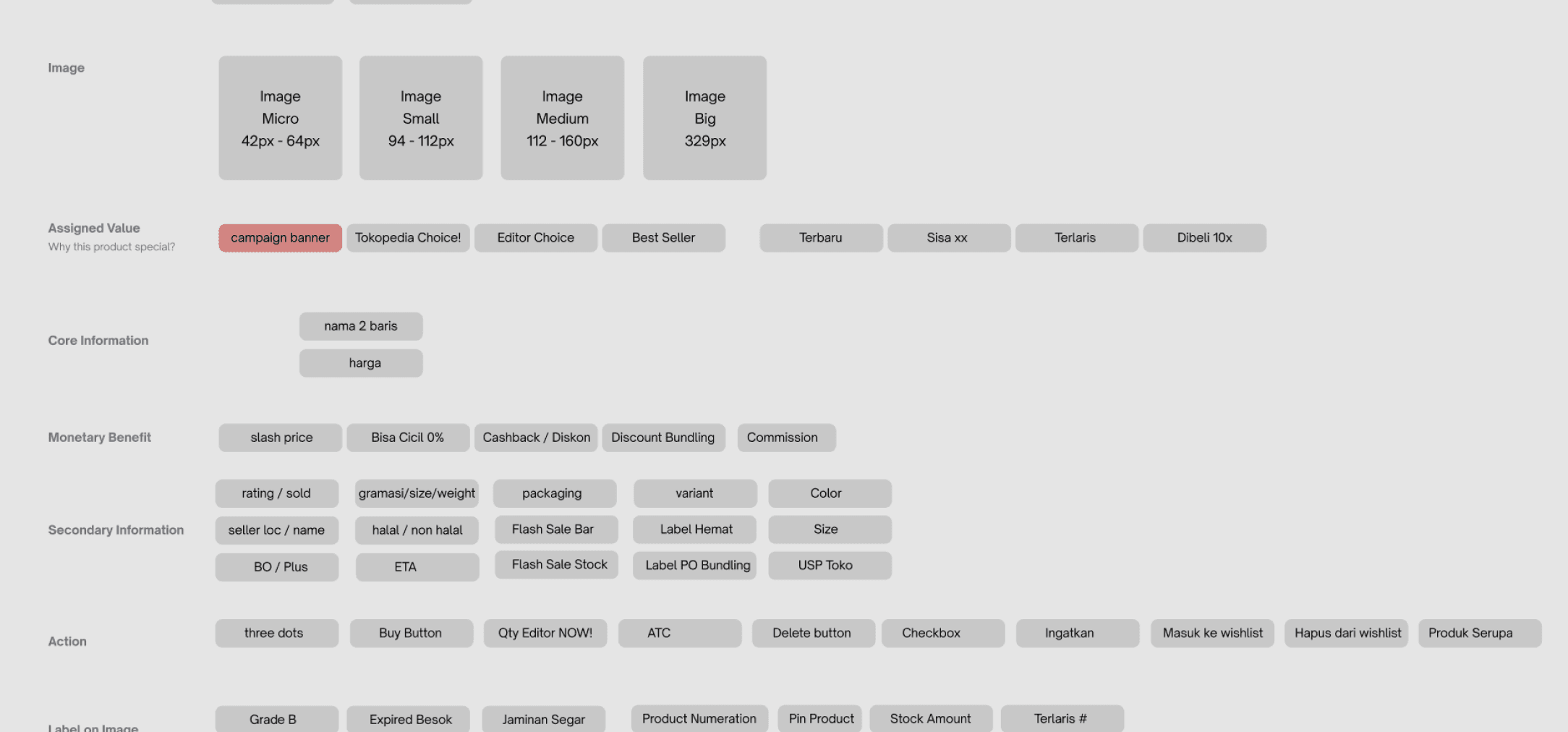
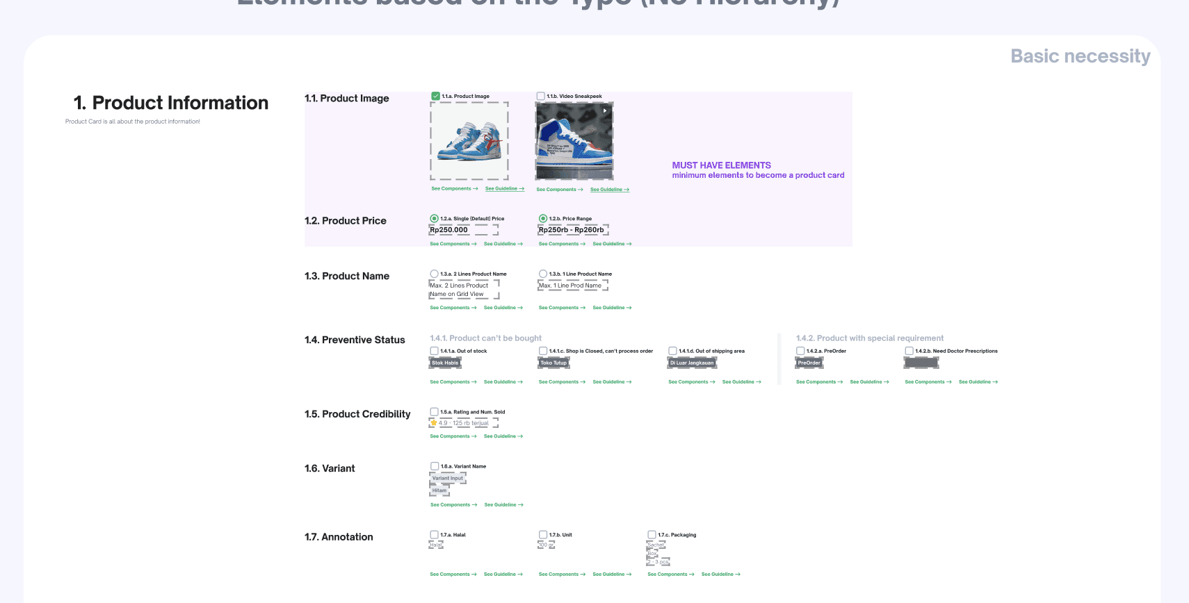
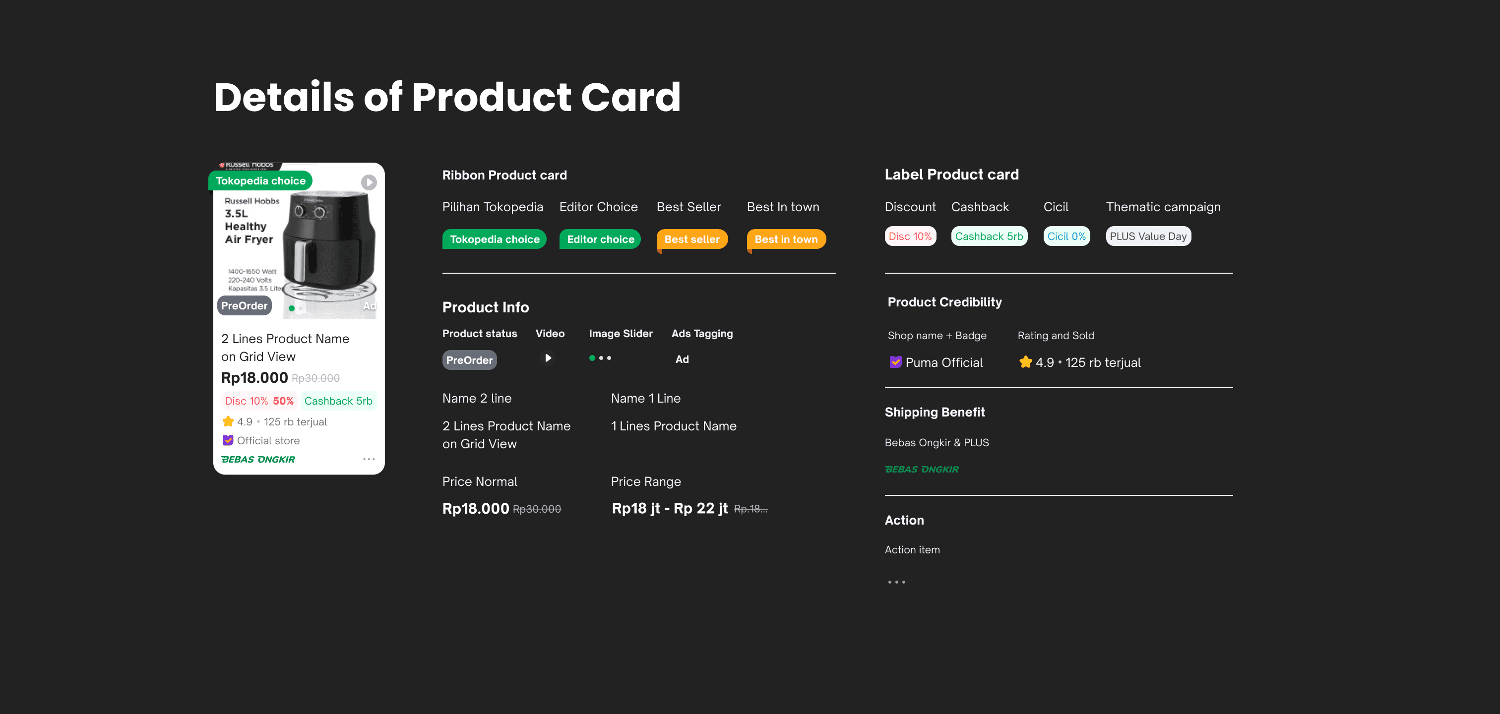
Redefined the component structure to align with requirements across all Tokopedia pages while collaborating with tech teams to ensure design and structure consistency.
Increase a users engagement by highlighting and occupied more promotions and bring festive value into our products.
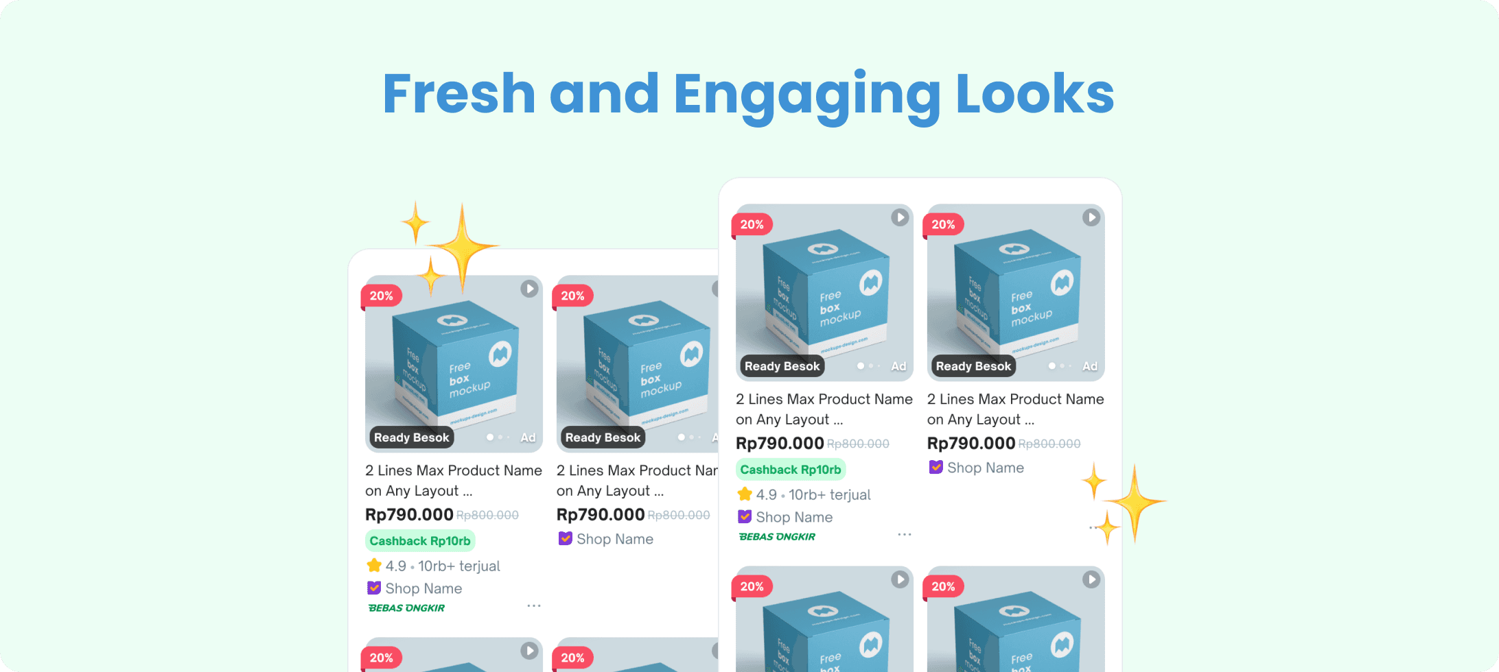
After extensive design iterations and collaborative discussions with other teams, we finalized a refreshed design for Tokopedia's product cards. This update introduces a modernized style, refined terminology, and improved logic to enhance both functionality and user experience.

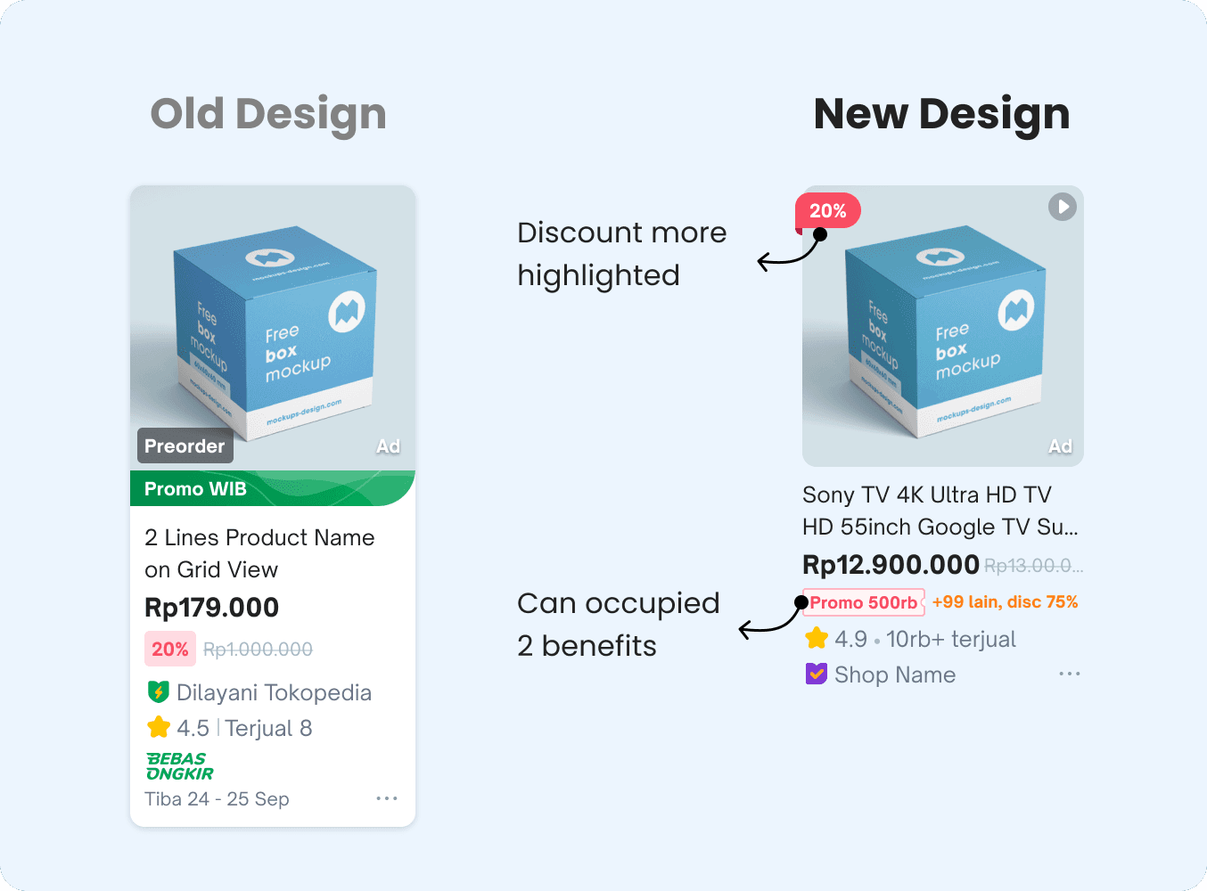
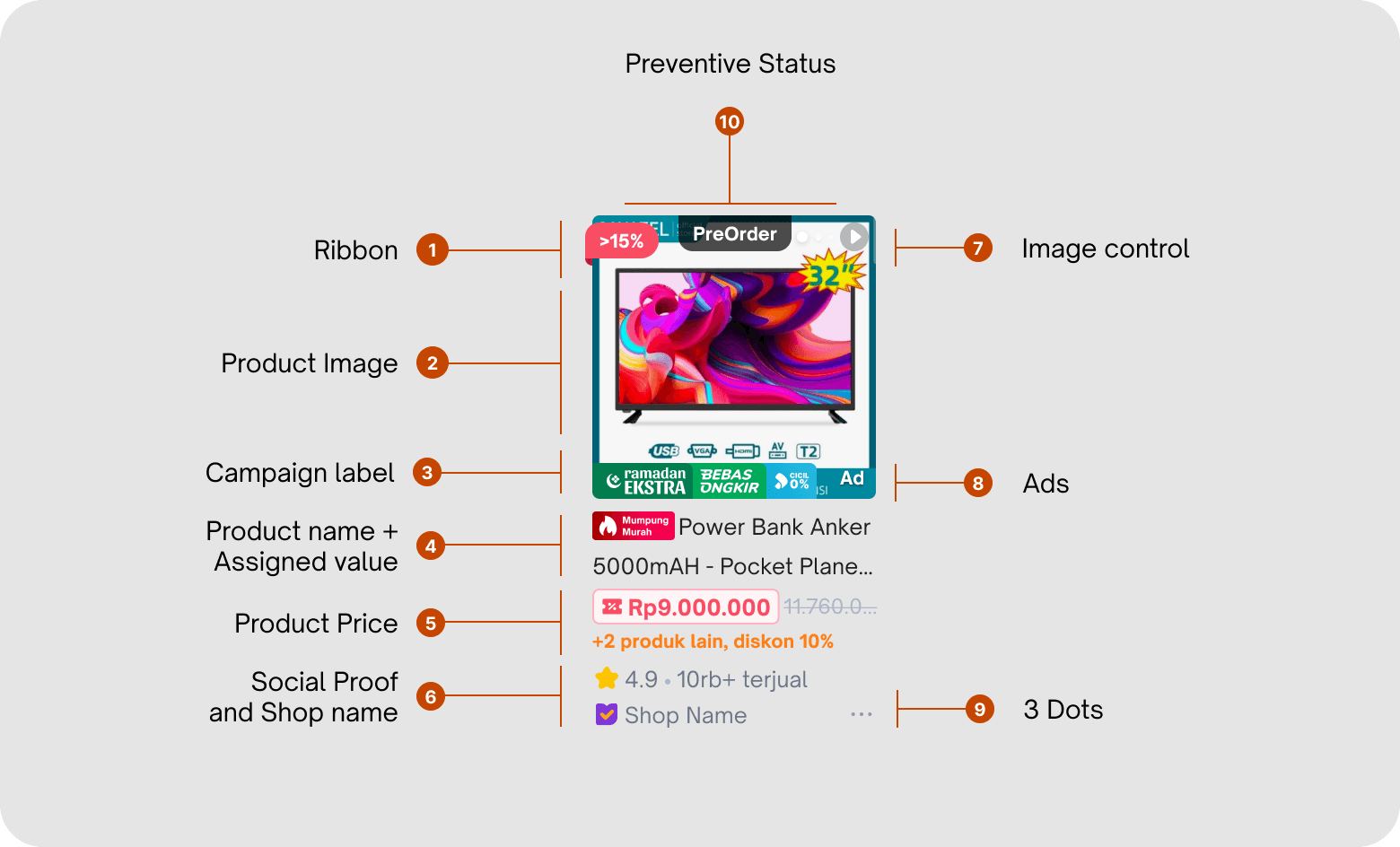
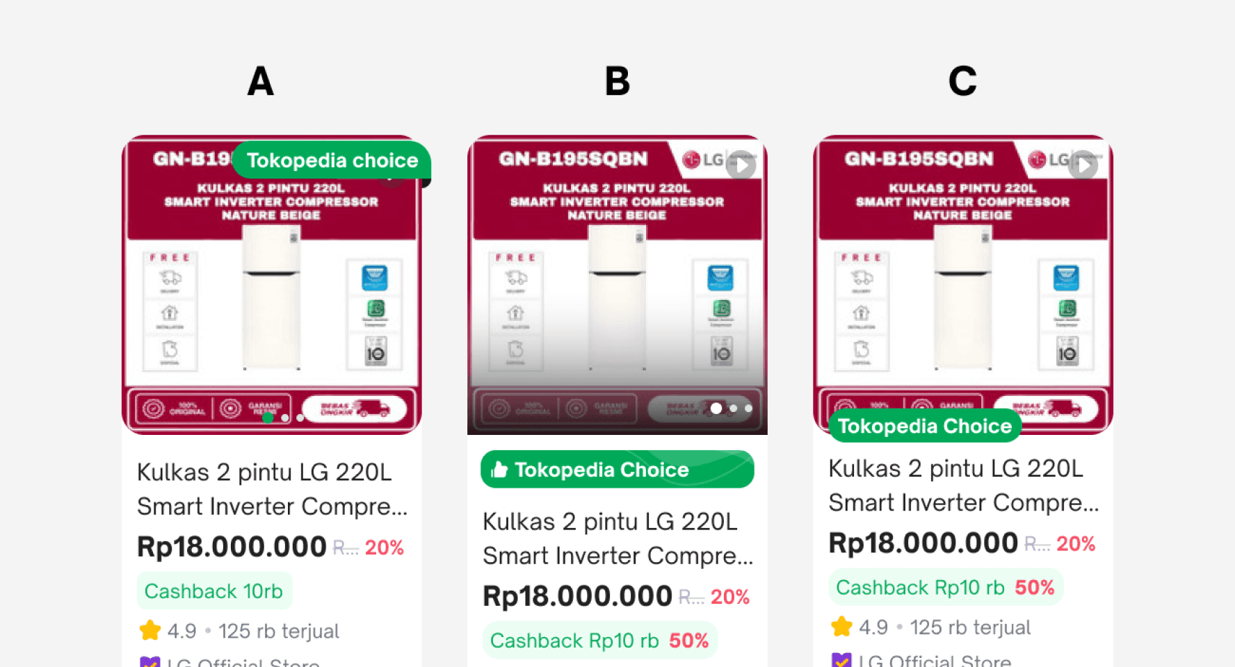
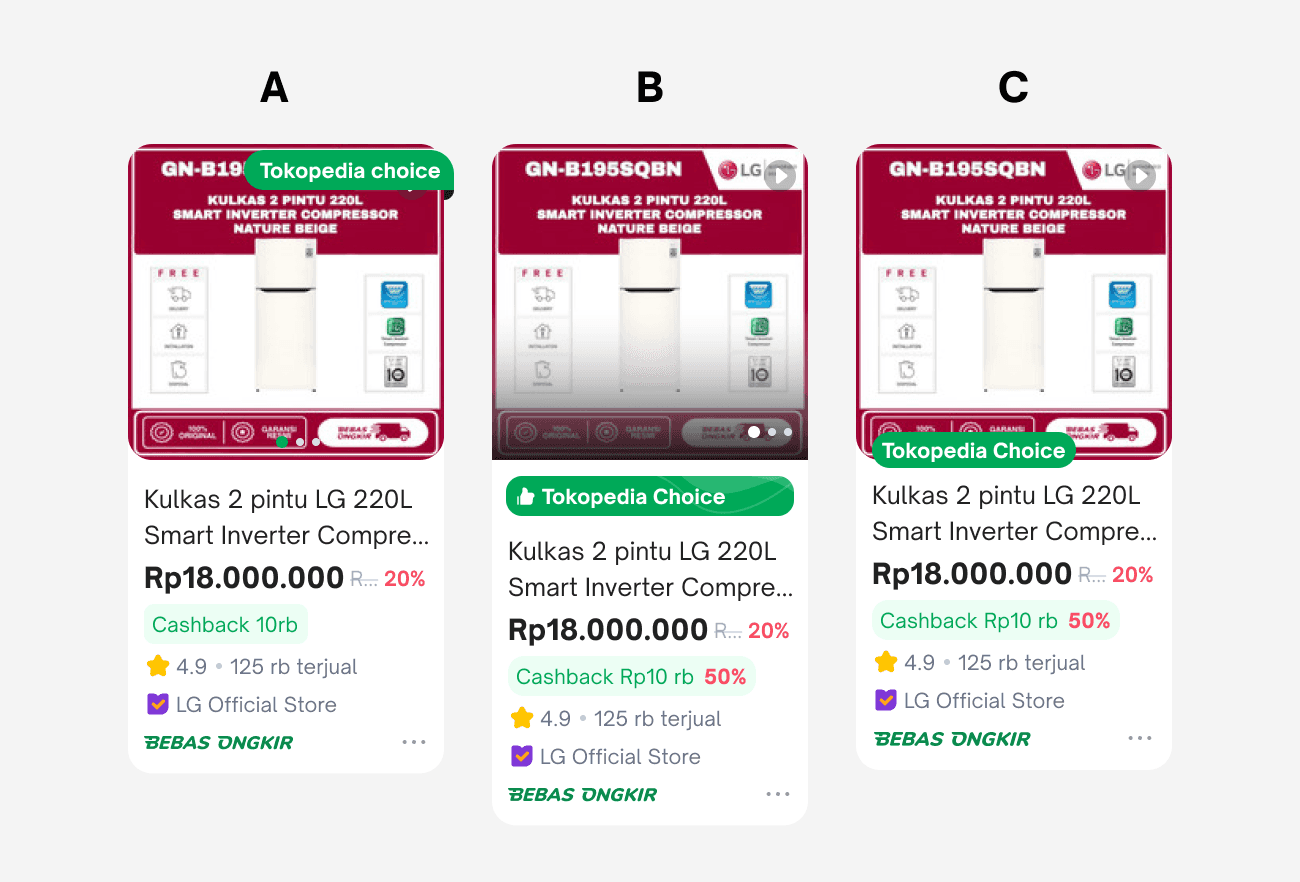
Before, our product cards didn’t make discounts stand out, so users often missed them. To fix this, we made the discount to be more highlighted and moved it to a more visible spot. We also improved on how we show user benefits, so people can see the value right away.
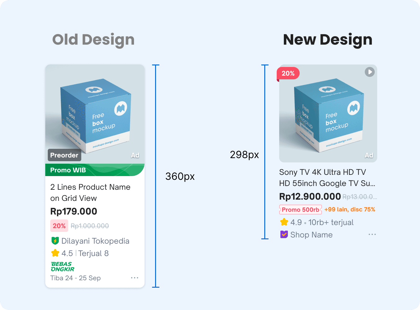
Not only focusing on how we eliminate unimportant informations on product card, we also have a focus on how we reduce and keep our product card shorten as possible but still informative. With the new product cards, we can reduce 17% of total height. With this, we can show more product card after user click search.

New Tokopedia Product Card right now can show more benefit to our users without increasing heights. We also added a feature that automatically calculates the final price. So users can exactly know the exact price they'll pay. To help increasing buying decision users, we create a selling point tag to make user easy identify of good quality products.
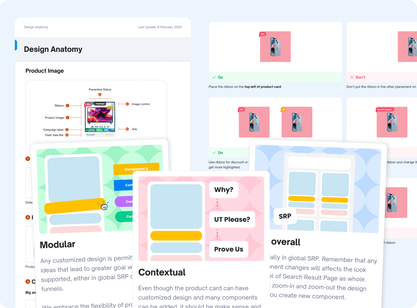
Not only the about the users, but we are also thinking about the usage of product card for internal side. We decide to develop and create a new principle and guideline to help internal teams know and understand how is the product card works. On this guideline we providing do and don’ts, use cases, logic explanations, guideline, and alo FAQ.
This was my first giant project that handled with myself, it was challenging. It taught me the importance of becoming a decisive and bold designer taking steps not to be an executor anymore. It requires wise decision-making with a very broad perspective and considering broader perspectives and collaborating actively with stakeholders and tech teams. Communication is key to ensuring that every change aligns with the initial plan.
can boost 71-80% increasing app performance, reported by tech.
By reducing lagging in app loading.