In Q2 2025, I was assigned to handle TikTok Checkout revamp. In Q2 2025, Checkout revamp was becoming the highest prioritization of design initiative. As a person in charge to do this revamp, I led the team to do end-to-end process starting from finding core problems until proposing design and next action to product team.
The process
Identify core issues using the latest quantitative performance data
Conduct competitive benchmarking across SEA marketplaces
Define new objectives and goals for checkout page
Propose and validate checkout concepts through user research
Present refined designs and actionable next steps to the product team
Challenges
Tight timelines, we only have 2 months.
We don’t have strong qualitative feedback to starting this project.
We need to strengthen our based reason why we don’t to do this checkout revamp.
Result
We validated the design through user research with 20 participants in Indonesia and Thailand.
From our user research, they said our new design proposal was clear and consistent.
3 project initiated from this project to drive users to checkout and increase their level of confident to buy
To ensure the smooth deliverable process, I led to define the scope of the projects, set a clear objectives, and planning a good timeline for all revamp entire process.
To uncover problems, I proactively consult with product teams to understand business expectations. At the same time, I’m doing a comprehensive analysis of the latest quantitative checkout performance data and review recent user research related to the checkout experience.
Product POV
User POV
Improving CVR in all across SEA
We see from data, the ID is only 10.66% and there’s a gap 6% data if we compare with other regions.
UI optimization
Improving current informations architecture, layout, size, and spacing
We run the competitive benchmarking, to see how other competitor works. We set a focus on this benchmarking is that we want to see about the design pattern, how they show the informations, and the style of each platforms including text, font size, and spacing.
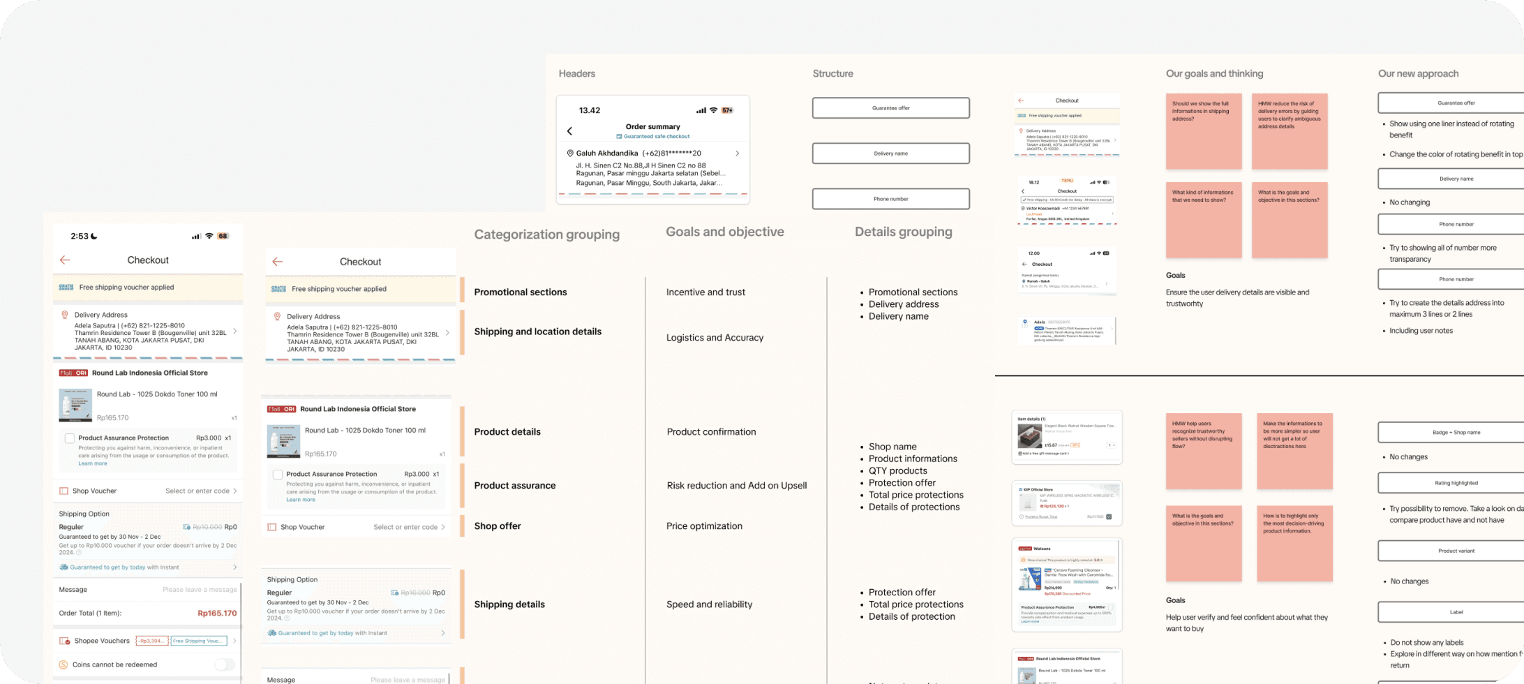
After conducting the competitive benchmarking, we got some insight after we compare our products with them, and also a gap opportunity.
Summary competitive result
There’s a clear design pattern shared across Shopee, Lazada, Temu, and Tokopedia.
One of the key patterns we identified is section-based layouting.
We also found that each platform follows a consistent design guideline, which helps their interfaces appear cleaner, more harmonious, and visually consistent.
We also found a different structure between us, they put payment method first then order summary.
Opportunity summary
Comparing with us, some of our design don’t have a pattern for example of using icon and text size.
Inconsistency between section in our page. We can see there’s a multiple different icon size, colors, and how we show the informations.
Hard for users to understanding section by section in our page because current information is like racing to get more highlight.
From benchmarking, order summary was the last part user see as user last validations.
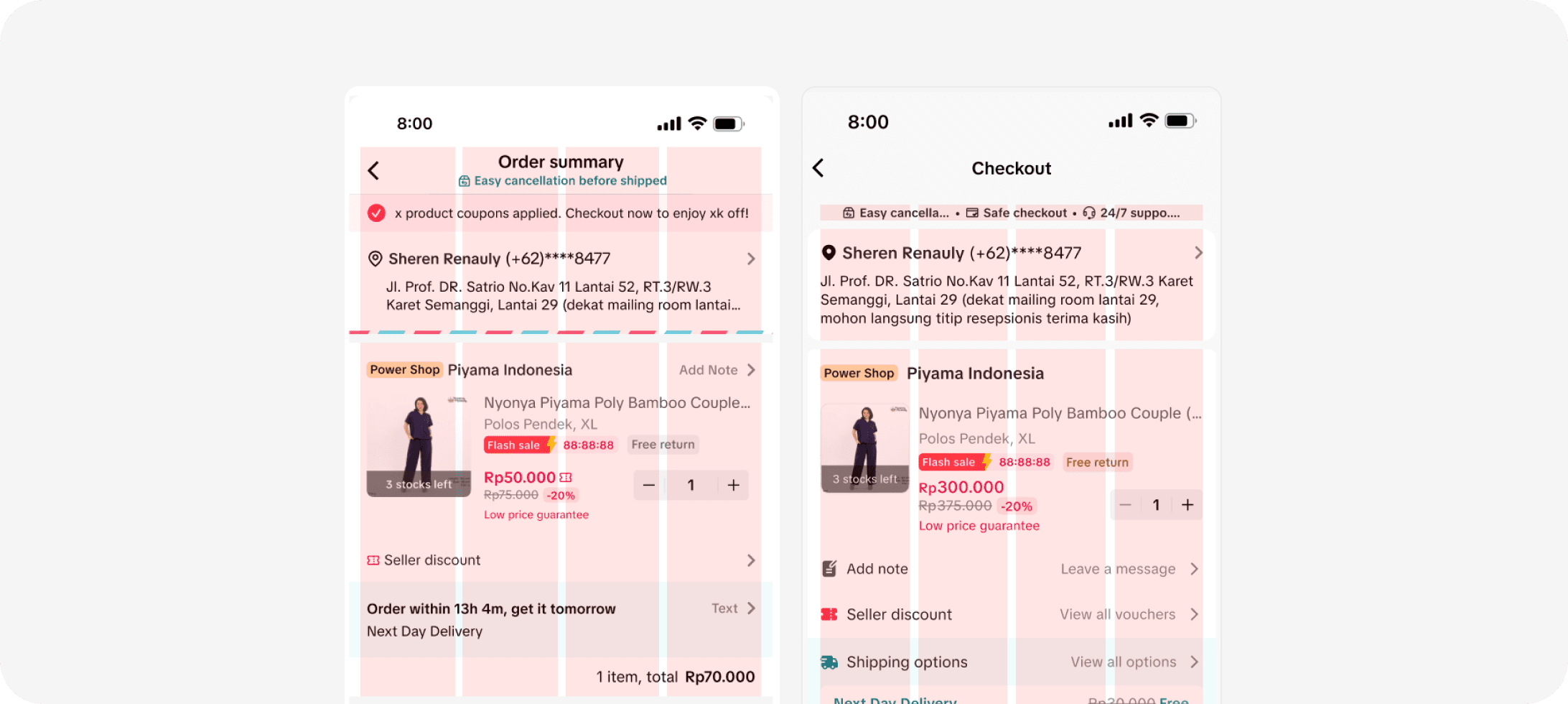
In the previous design, we do not have a goals. We just focused on how help user convert and directly buy a products. But right now, we need a goals to help us more easy to define what is our end goals for our products. From alignment with product, after conducting a user research, and discuss with product design stakeholders, our new goals for Checkout is
To answer our goals and provide a better solution, we trying to figure out the new concept of Checkout page design, we come up with a new design principles to help us more easy to define.
Clear Sectioning
By applying a section grouping here and aligning spacing, icons, and layout elements, the design achieves a balanced, professional appearance that improves scan ability and reduces visual noise.
Information Clarity
Sections are organized into clear, focused cards, such as address, shipping, and payment, helping users easily scan and understand content without being overwhelmed.
Improved Readability
A standardized typographic system with consistent font styles and sizes improves the overall reading experience, reduces confusion, and gives the page a more cohesive feel.
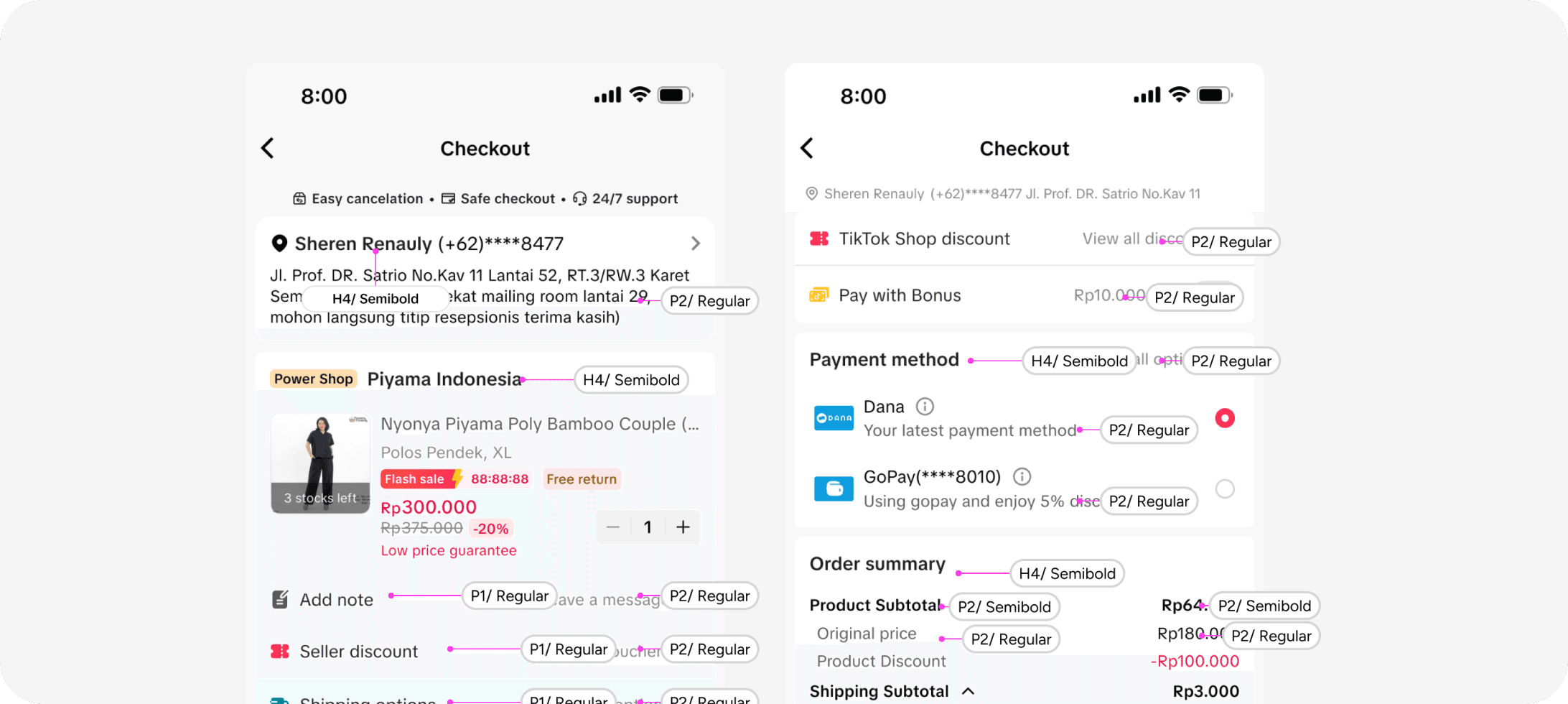
4 column grid
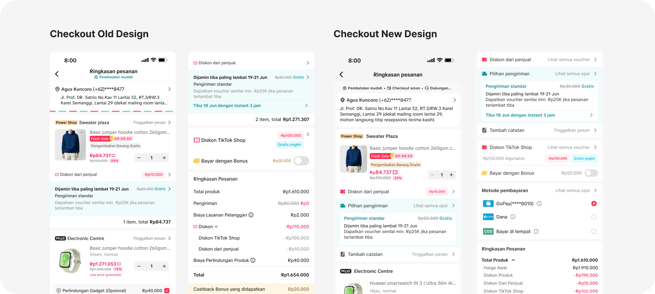
We introduced a 4-column grid to create a solid layout structure. This grid ensures all elements are aligned consistently, helping us maintain visual balance across the page. The result? A layout that’s cleaner, easier to scan, and feels more professional, especially on mobile.
Card base style
Each section is grouped into clear, focused cards, like address, shipping, and payment , making it easier for users to scan and understand information quickly.
Opportunity summary
In the old design, too many font sizes made the page look cluttered and confusing. Now, we’ve standardized font styles and sizes, a consistent typographic system improves readability and gives the page a more cohesive feel.
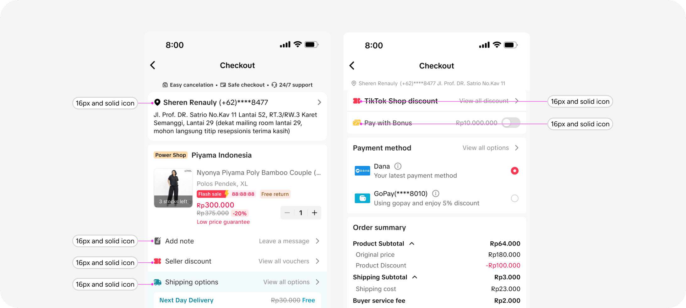
Standardize spacing
From icon sizing to spacing and padding, everything is aligned to create a familiar and intuitive structure. helps users quickly recognize patterns and navigate the page with confidence.
Based on latest experience and the problems that we have, I have a proposal solution to address them using the newest strategy
4 Column Grid
We’re introducing a four-column grid to bring structure and visual harmony to our checkout interface. By anchoring every element to a consistent grid, we’ll achieve a same spacing and clear alignment. This foundation not only reinforces brand consistency but also guides users smoothly through each step of their purchase journey.
Cards make scanning easy

We transform to a card-based layout instead of a basic list. This approach helps users to spot each section faster and scan the key information they need.
Font consistency boost clarity
Our design currently uses too many font sizes, which makes the page look messy. We’ve defined clear rules, one size for headers, one for body text, and one for small details. This standardization makes text uniform, helps users read faster, and gives the page a cleaner look.
Consitent is a key
Standardized icons, spacing, and padding for a harmonious layout that’s easy to scan. Consitent in every section is a key.
We conducted usability tests in Indonesia and Thailand to compare the new and old checkout pages across multiple research objectives. Our background is we want aim to test the perception of the new checkout design against the current design. With these improvements, we seek to gain deeper qualitative insight into the user journey with several objectives.
What they say about new design
Easy to navigate
Overall navigation feels more obvious, e.g. "View All Options >" in the shipping or coupons are clearer to indicate that it has other options.
More consistent
Icons style and layout on the seller discount, shipping, and platform discount feel more tidy and consistent.
Help them easy to scan
Consistent design within each section allows users to scan faster and signals a fresh platform experience. Users also find navigation easier in the new design.
Product tiles
Our design currently uses too many font sizes, which makes the page look messy. We’ve defined clear rules, one size for headers, one for body text, and one for small details. This standardization makes text uniform, helps users read faster, and gives the page a cleaner look.
Vouchers and bonus
Nearly all users in both Indonesia and Thailand know that coupons are automatically applied in both old and new designs. The new design has cleaner UI and more intuitive navigations. Which can make users know there's another voucher easier.
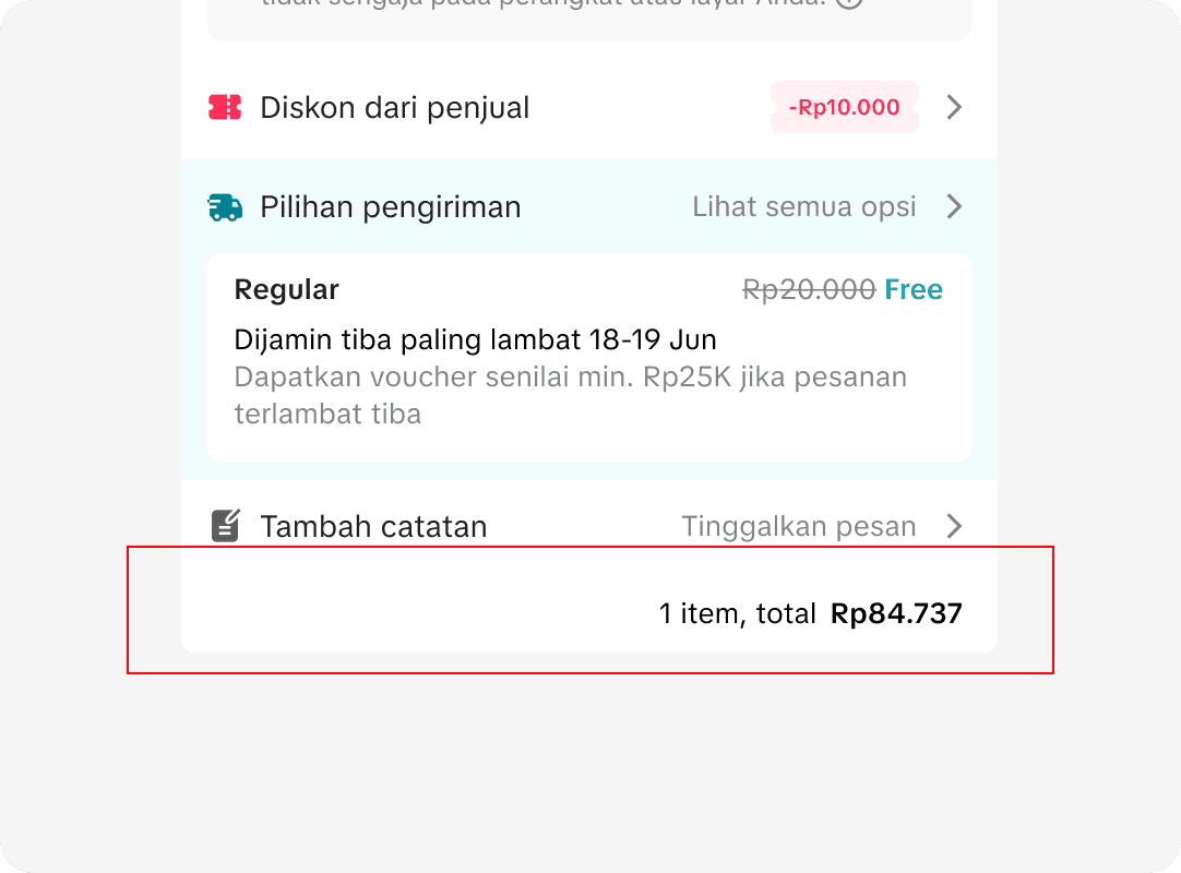
Order summary
Preference for simplicity: Users want a concise, single-page summary with key items (total, shipping, discounts) grouped. Overly detailed breakdowns (e.g., separate product vs. platform discounts) can make users confused.
Bottom navigation
Many users miss the savings info in the old design; it’s much easier to spot in the new design. While the “Congratulations” banner feels lively, most users prefer the new design’s because of clear, direct savings display. Especially in Indonesia, where the old banner often gets cut off and ignored.
We used the feedback from our user tests on the new design proposal to guide further iterations. By analyzing comments and spotting pain points, we made targeted adjustments, like refining labels, improving spacing, and enhancing visual consistency, to boost clarity and overall usability.
Product tiles - Shipping options
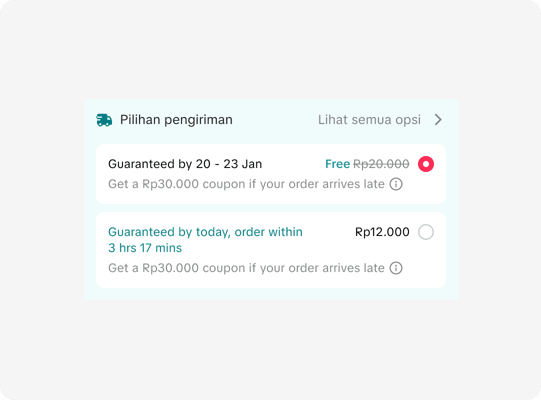
Some users show interest in using instant shipping, especially when buying expensive items and it's free shipping, as it is perceived to be the safer method. However, many of them didn't notice it during the demo.
Product tiles - Subtotal price
Some users said the subtotal price provides better clarity on the price that they actually get in the store level purchase. They can better determine if the final price in each store has already included the seller coupon, and also helps if the shipping fee is not totally free.
Order summary
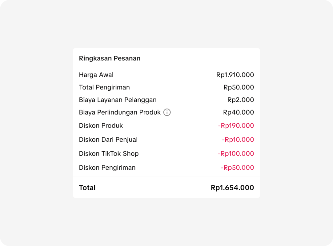
Preference for simplicity: Users want a concise, single-page summary with key items (total, shipping, discounts) grouped. Overly detailed breakdowns (e.g., separate product vs. platform discounts) can make users confused.
Bottom navigation
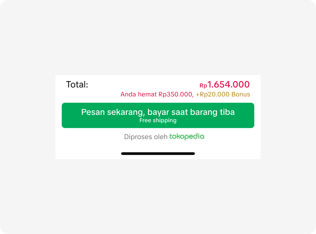
Many users miss the savings info in the old design; it’s much easier to spot in the new design. While the “Congratulations” banner feels lively, most users prefer the new design’s because of clear, direct savings display. Especially in Indonesia, where the old banner often gets cut off and ignored.

General output
This project is currently in Q3 development. From day one, we held a kickoff meeting and worked closely with the Product team to align our goals. It has supported the Product team in shaping a Q3 initiative focused on improving user conversion and reducing cognitive load on the checkout page.
Support product team
Through this project, we’ve already helped the Product team launch three initiatives aimed at supporting user decision-making highlighting instant shipping, enlarging key buttons, and placing saved information close to those buttons for easier access.
Research report
We now have a comprehensive checkout research report that reveals the key factors influencing online shopping and our product’s position in users’ minds. This insight comes from our study in Indonesia and Thailand, involving a total of 20 participants.
Reflection
This project had a very tight and demanding timeline, requiring strong collaboration and careful time management to keep everything on track. I worked closely with the design team, holding regular weekly meetings to ensure smooth progress, and partnered with the product team to set priorities for upcoming initiatives. This experience sharpened my ability to manage timelines effectively and prioritize design initiatives based on importance, impact, and the availability of technical resources.